Here are a couple reposts from Bikocity. The first documents the rise of bike commuting in the US, especially in “Bicycle Friendly Communities” and 10 key cities. The second repost is about how Bicycle Friendly Communities are evaluated. Check them out:
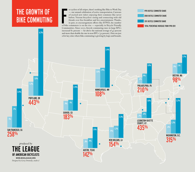
Where Bike Commuting Grows Fastest (Infographics)
The League of American Bicyclists recently created some cool infographics about bicycle commuter growth across the country.
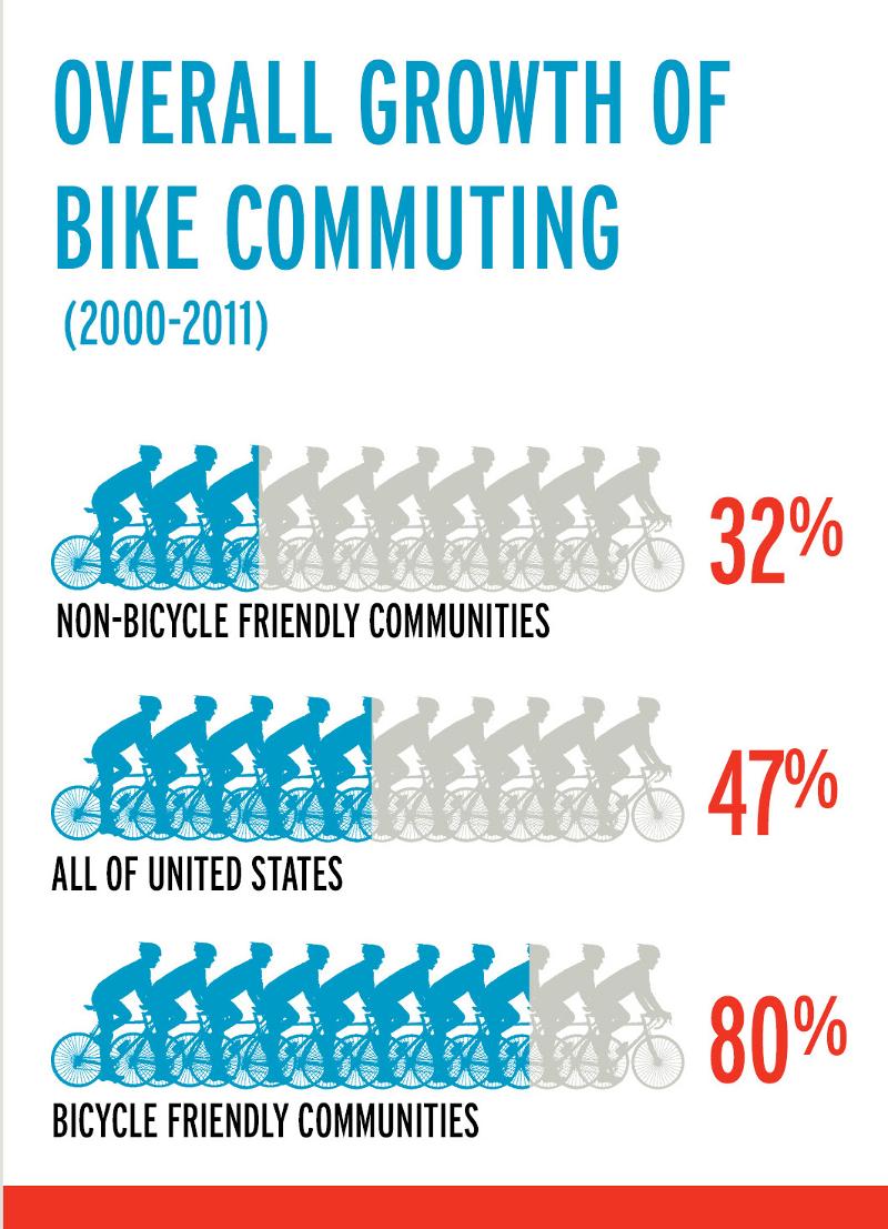
In general, bike commuting has skyrocketed, doubling from 1.7 billion in 2001 to 4 billion in 2009. However, the growth has occurred to a much greater degree in cities and towns that have been designated as Bicycle-Friendly Communities by the League.
“From 2000 to 2011, the bicycle commuting rate has risen 80% in the largest Bicycle Friendly Communities — far above the average growth of 47% nationwide and more than double the rate of 32% in the cities not designated as bicycle-friendly,” Carolyn Szczepanski the League writes.
Several cities have even seen growth of 100% to 450% [PDF]!
Want more data? Carolyn’s rounded some up for you:
Looking for bike commute data for your area?
- Click here to download 2010 bicycle commuting data for all 375 citiesincluded in the American Community Survey
- Click here to download bicycle commute data from 1990 to 2011 for the 70 largest U.S. cities, including percentage of bicycle commuters and percent change
- Click here for 2011 state commute rates, including bicycle commuting by gender
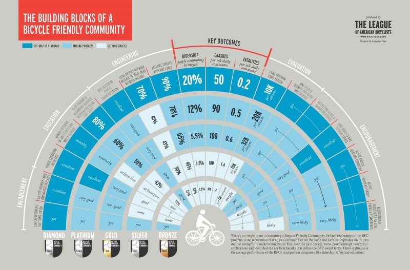
How Bicycle Friendly Communities Are Evaluated (Infographic)
Several years ago, I was the director of an organization in the Charlottesville, Virginia region that got Charlottesville designated as a Bicycle Friendly Community (BFA). There were great guiding documents that the League of American Bicyclists supplied as part of the application process, but it certainly would have been nice to have this infographic* below that the League just created to delineate the differences between Bronze, Silver, Gold, and Platinum awardees. Check it out. You can also download a PDF version here.

To make it clear that this isn’t a strict tool for measuring which category a community falls into, the League’s Carolyn Szczepanski adds:
“Now, the beauty of the BFA program is the fact that it’s not one-size-fits-all. We’re able to take into account the unique characteristics of each community — so it’s not a rigid rubric. But we love the way this distills some of the key benchmarks and metrics in an interesting and engaging way.”
*Note: the infographic was developed in coordination with the Language Dept for the League of American Bicyclists.

