(Note to front page viewers: must open the page to see the graphic in action.) This dynamic graph (or GIF, to be technical) is one of the best graphics I’ve seen (ever.. on any topic). It so accurately explains, or showcases, global warming “skeptic” (i.e. denier) logic. Basically, it highlights how they can go on cherry picking for ages and continue saying “the world is cooling” when it’s obviously warming.

From the post it came from, “Going Down the Up Escalator,” here’s the on-point intro:
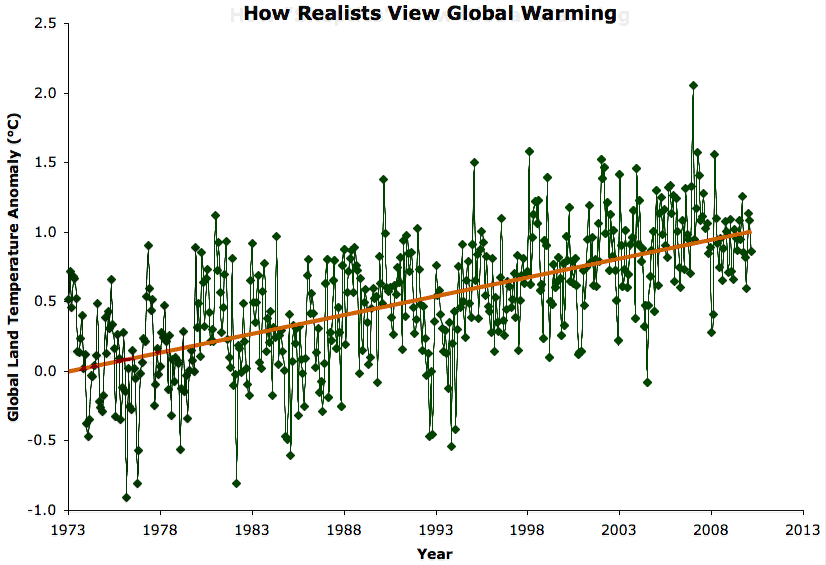
One of the most common misunderstandings amongst climate “skeptics” is the difference between short-term noise and long-term signal. In fact, “it hasn’t warmed since 1998” is ninth on the list of most-used climate myths, and “it’s cooling” is fifth.
This myth stems from a lack of understanding of exactly what global warming is. The term refers to the long-term warming of the global climate, usually measured over a timescale of about 30 years, as defined by the World Meteorological Organization.
For more, read the full post (linked above). It’s a good intro on how we know humans are causing global warming.
In the “going down the escalator” link above, Dana talks about Dr Roy Spencer. (one of the climate change denier scientists) I certainly wouldn’t put any stock in what he says. The man doesn’t even understand the basics of an interglacial.
http://www.leftinalabama.com/diary/8485/an-interesting-moment-with-the-top-agw-skeptic
Dragontide: “Do you dispute NOAA and the WMO’s claim of 316 consecutive months the world temperature has been above average? Even the peak of an interglacial can’t do that. Cosmic ray effects on cloud cover can’t do that. The sun did not get hotter. There is no massive natural leak of Co2 anywhere. That only leaves the AGW gasses. (and the warmer bedrock of millions of years ago)”
Dr Spencer: “you have no clue what happened during the peak of interglacials. No one does. To claim you do makes me question your credibility.”
Dragontide: “During the peak of an interglacial, the temperature is above normal 3-4 months per year and COLDER than normal 3-4 months per year. It’s when the earth’s orbit is at it’s most lopsided in it’s wobble orbit around the sun. The earth does not move closer to the sun and stay there year round at any point in time. The next one (interglacial period) will begin about 6000 years from now. (with the peak’s beginning, 1000 years after that)”